Your website design is crucial to your B2B marketing campaign.
In the first 0.05 second of viewing a site, most visitors will form an opinion. It’s not much time to make a great first impression.
Your site’s low-quality appearance can give the impression that you don’t take your business seriously. Even worse, visitors might assume that you’re not trustworthy and go elsewhere.
What can you do to make your website look presentable in light of the above? There are several web design best practices that you can use.
This article will reveal ten best practices for website design that you should keep in mind while designing your B2B website. You should be able to create a B2B site that converts well by the end of this article.
1. Keep Branding Consistent
Branding is the combination of all visual elements on a B2B site that makes it stand out from its competitors. This includes its logo, fonts, images, texts, colors, etc. Domain names, brand voices, and font styles are also important in branding.
When designing a B2B site, consistency in branding is key. It creates a familiarity that is comforting to B2B clients.
Lucidpress has released a report that shows consistent branding can boost a company’s revenues by up to 20%. A website that is inconsistently designed can cause visitors to become confused, and they may leave your site.
You should use the same color scheme and font on all your pages. Incorta’s homepage and About Us pages maintain a consistent appearance.
2. Remove clutter from your website
Visual clutter can negatively impact the user experience of your website. Visitors are overwhelmed by too many design elements, and a lack visual hierarchy can confuse them.
When designing your B2B site, you should take a minimalistic approach.
Websites for B2B or e-commerce use minimalist design to create a clutter-free experience.
This means that you should use screen space (including negative space and white space) as well as asymmetrical designs to create a neat aesthetic. Mercury Bank is a good example of a website that has a clean design.
3. You can improve your site’s navigation
To drive conversions, your B2B website needs to be easy to navigate. This means providing a frictionless experience for visitors.
Make it as easy as possible for visitors to find the information they require in as little as time as possible. You risk losing them forever if you don’t. You can:
Place your navigation options in the center of the screen: The majority of websites have a horizontal menu at the top. If you can, stick to this style. The navigation bar should be positioned in this manner.
Name Links Appropriately. Your visitors will navigate your B2B website using page links. So name them appropriately to prevent confusion. You can name your link “About Us” if you want to make it easier for visitors to understand.
Highlight Interactive Elements. Clickable elements such as links and buttons must be readily visible to the visitor. Incorporate hover effects to change the color of a link or background color (as shown below) and trigger animations into your website’s design. This interactive feature will help to engage visitors with your B2B website.
4. Navigation linksSource
Make your logo clickable as users may expect that clicking on the logo will take them back to the home page of your site. Avoid clogging up the navigation bar of a site with a lot of content.
Keep your call-to action text short, perhaps between one and three words. Examples of concise call-to-action include “Get a Quote,” “Register,” and “Get a Quote.”
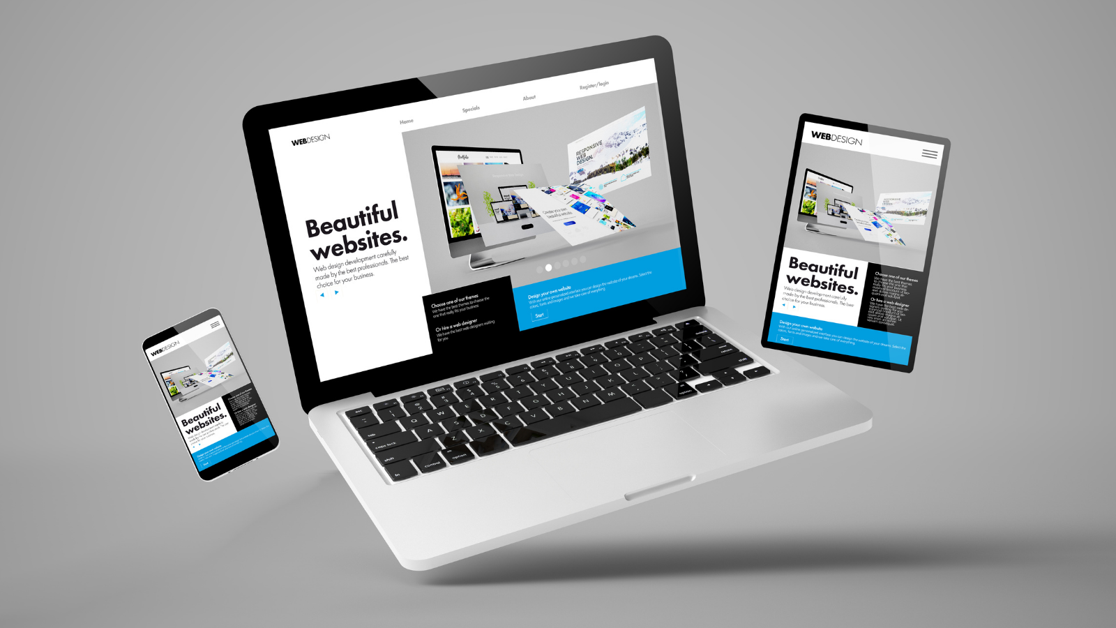
5. Make Your Website Responsive
A responsive website changes its design depending on the size of the screen it is viewed on. A site accessed through a mobile device may display a hamburger menu that can be clicked, while desktop users see the entire menu in a horizontal bar.
A mobile-friendly site is an essential design element, especially when you consider that more than half of all web traffic comes from mobile devices. You must make your website look great on mobile devices if you want it to have a low bounce rate.
You risk providing mobile users with a bad user experience if you don’t use responsive design. The elements may be squished together, too small to read (as shown in the image below) or off the page. Your site will appear unprofessional.
6. Add Social Media Buttons
Inbound marketing is not complete without social media. Social media is likely to be used by your target audience for 147 minutes per day. It is therefore a no brainer to include social media links on the website.
Visitors to your website can be encouraged to interact with your brand by using social media icons. Follow your brand on Instagram and Facebook to get the latest updates and offers.
Social media buttons, for example, can help you quickly spread your content if you run a blog that makes money.
Social icons can be placed anywhere on your website. The choice of placement depends on how important it is to convert visitors into followers on social media websites
7. Mobile responsive
Ensure that your website looks great on all devices. You can ensure that your B2B website is responsive by using a responsive WordPress template or by designing it with a mobile first approach.
The best landing page and website tools also create mobile-ready designs. You may therefore want to consider investing in them.
8. Prioritize SEO
Optimizing your B2B website’s design for search engine optimization should be a top priority.
Most people think about keywords and backlinks when they first learn about search engine optimization. Search engines use hundreds of factors to recommend sites to potential clients. Some of these factors are relevant to web design.
9. Increase Page Loading Time
A hosting company that is SEO-friendly can improve page loading speeds. It’s a fact. However, your B2B website design choices can impact your site’s performance. If your site is slow to load, your bounce rate will increase.
Adopt the following measures to increase page loading speed:
Code Deferral : When displaying your site, the visitor’s web browser will not render each and every line of code. This extra code can cause your website to slow down. By deferring unused codes, you tell your visitors’ browsers to only run the code required to load the page.
10. Test A/B
Website design is an exercise in continuous improvement. Expect to continue tweaking your B2B site’s design in the near future.
Instead of making changes based on personal preferences, you’ll make them in response to the behavior of visitors. You can gather data by A/B-testing to improve your website.
These tests compare two designs, to determine which performs better. You can test all visual elements on your website.
In closing
Your B2B website should be easy to navigate, responsive, clutter free, and use images whenever possible to improve understanding. Include calls-to action on your pages. Pay attention to loading speed and SEO.
Include social media buttons, run A/B testing, and maintain consistent branding. These buttons will help your visitors to connect with your business outside of the site.
You’ll be able to create a B2B site that converts well if you include these design best practices in your design checklist.